

Food Marketing in Beauty: What Every Brand Can Learn
Our brains respond to food faster than almost anything else. We don’t just see it — we feel it. The sight of glaze or the word “honey” triggers dopamine, the same chemical tied to pleasure and reward.
That’s why food marketing works so powerfully. And now, beauty brands have started using the same science — replacing flavor with texture, and taste with touch.
It’s no longer about “hydration” or “anti-aging.” It’s about skin that’s “glazed,” lips that are “juicy,” or a scent that feels “buttery soft.” When marketing evokes appetite, desire follows naturally.
Let’s break down how five brands use food psychology — and how you can apply these principles to your own business.
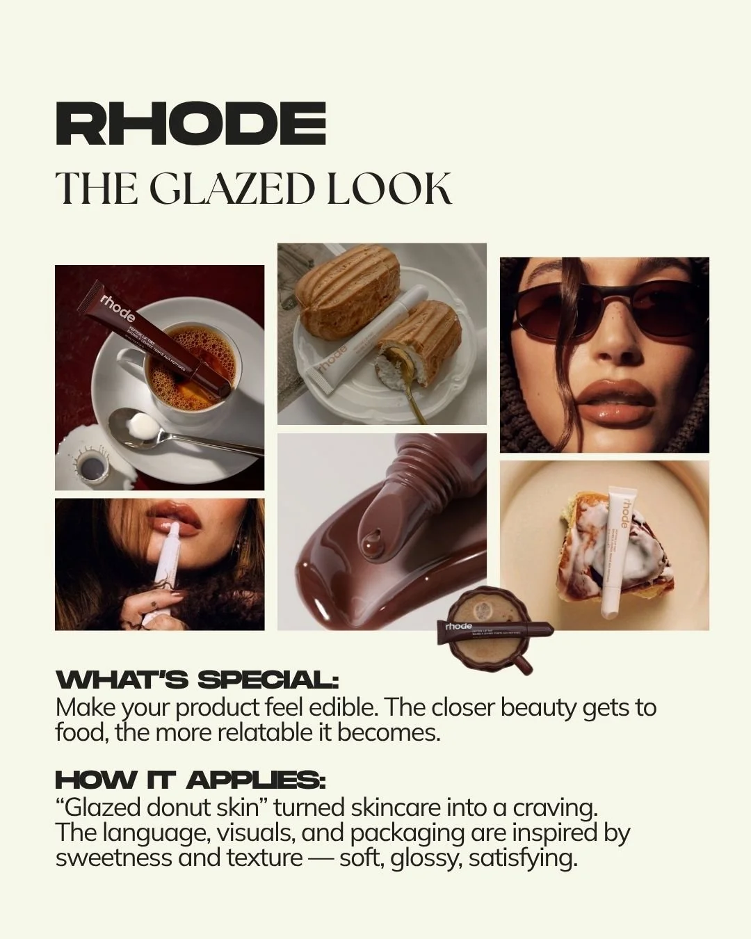
1. Rhode — The Glazed Look
When Rhode launched, Hailey Bieber didn’t just introduce another skincare line. She introduced a craving. “Glazed donut skin” became more than a catchphrase — it turned skincare into something people wanted to taste. The metaphor works because it combines visual imagery, texture, and emotion all at once. “Glazed” paints a picture of shine and smoothness; “donut” triggers comfort and indulgence.
This kind of copywriting is known as sensory language. It replaces sterile terms like “hydrating” or “formulated with actives” with words that awaken the senses — soft, dewy, warm, silky. It’s a reminder that people don’t buy benefits; they buy how those benefits feel.
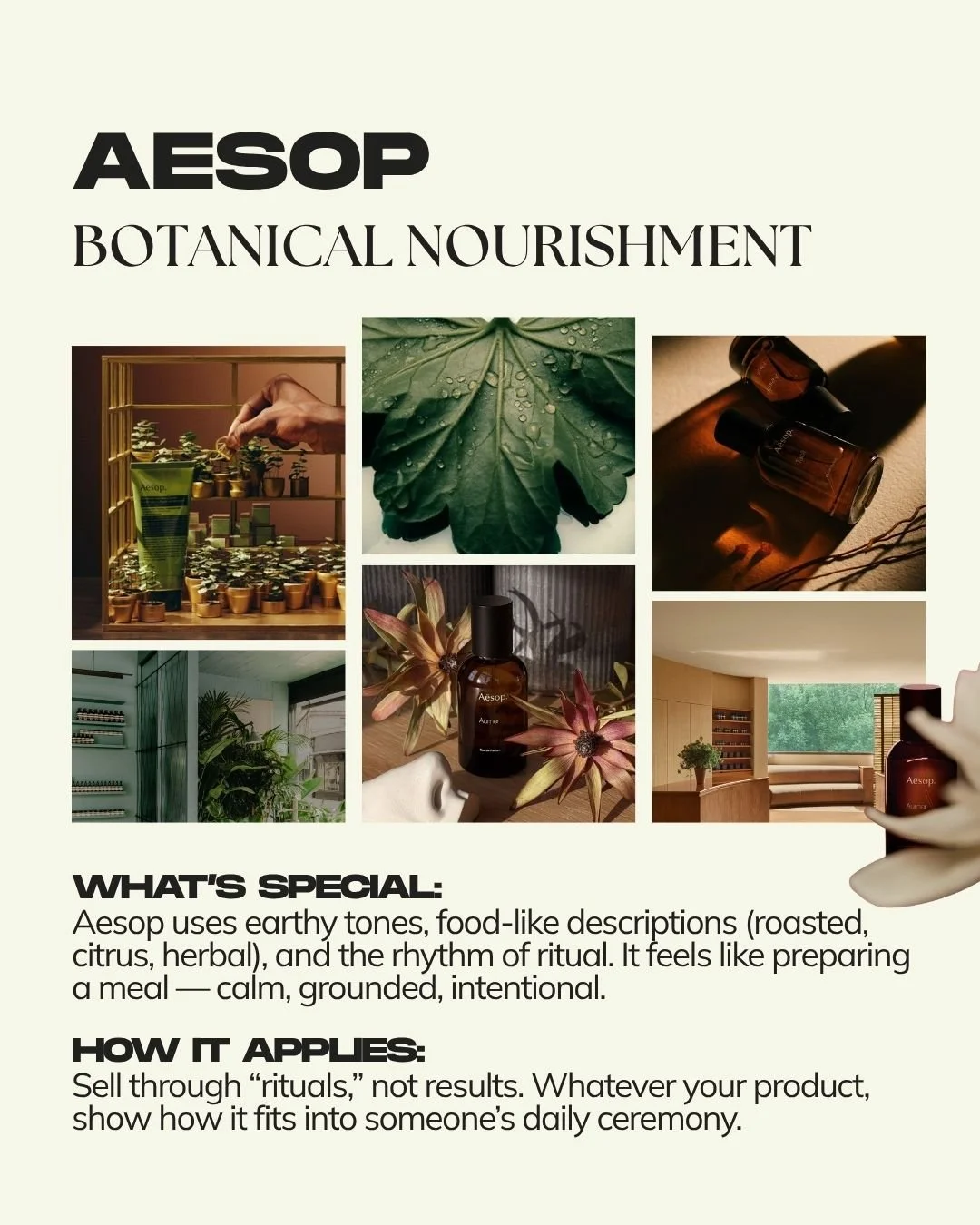
2. Aesop — Botanical Nourishment
Aesop is proof that you can make something as ordinary as hand soap feel like a ceremony. Their stores are quiet, earthy, and intentional. Their tone of voice feels slow and deliberate, with words like “herbal,” “roasted,” and “citrus.” Everything about Aesop mirrors the rhythm of slow living — like preparing a meal or brewing tea.
What Aesop sells isn’t cleanliness; it’s presence. Their marketing taps into ritual psychology — the idea that people attach value to repetition and intention. When a brand becomes part of someone’s daily rhythm, it naturally becomes part of their identity. For any business, that’s the ultimate form of loyalty.
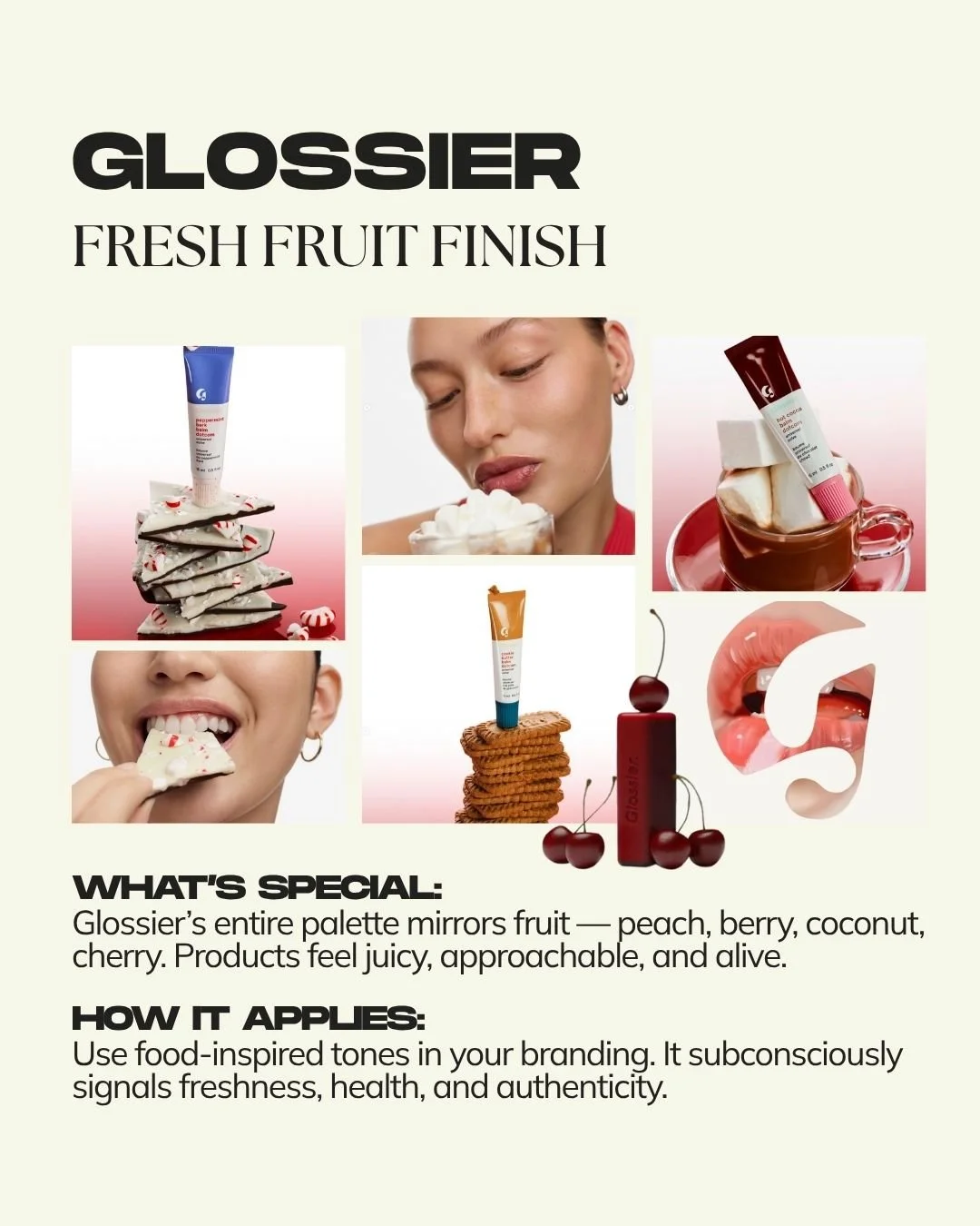
3. Glossier — Fresh Fruit Finish
Glossier’s entire identity is built around color and flavor. Their tones mimic fresh fruit — peach, berry, coconut, cherry — creating an immediate sense of liveliness and youth. This is a visual strategy rooted in cross-sensory association: our brains link colors to tastes. Warm, juicy tones feel energetic and alive, while cooler tones feel sterile and distant.
For brands, this means color is never neutral. It communicates texture, emotion, and flavor subconsciously. A peach-toned brand feels welcoming and optimistic; a berry hue feels rich and sensual. Even if your business has nothing to do with beauty, designing with flavor-inspired tones helps your visuals feel more relatable and real.
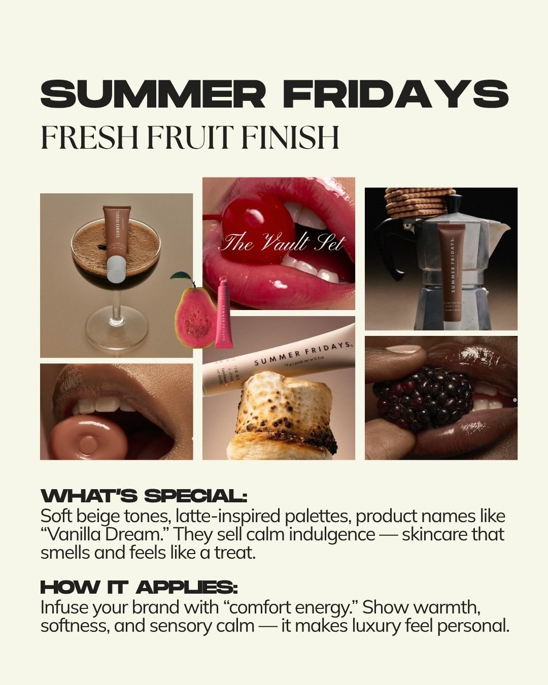
4. Summer Fridays — Skin That Feels Like Dessert
Summer Fridays mastered the art of calm indulgence. Their beige, latte-inspired tones, product names like “Vanilla Dream,” and creamy packaging make skincare feel comforting rather than aspirational. This represents a major shift in modern branding: luxury is no longer about exclusivity — it’s about ease.
People now crave softness, calm, and familiarity. Summer Fridays understood that self-care isn’t about status but about comfort. Their marketing feels like wrapping yourself in a blanket — it sells peace of mind. Brands that create warmth and sensory calm tend to connect deeper, because they meet emotional needs, not just physical ones.
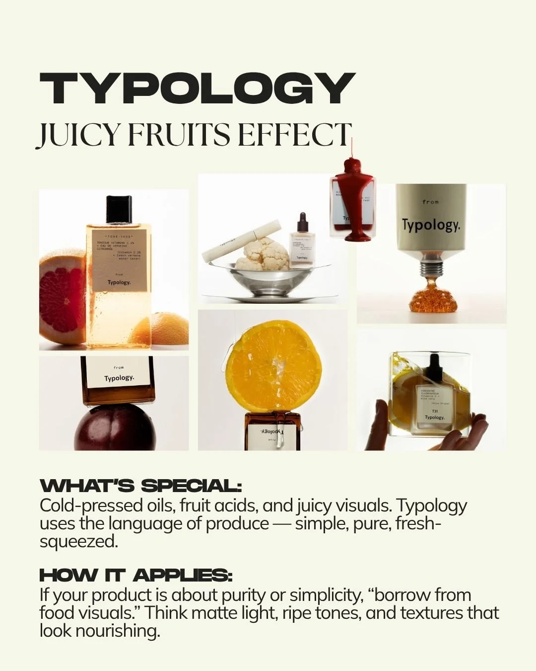
5. Typology — Juicy Fruits Effect
Typology, a minimalist French skincare brand, uses the language of fresh produce — cold-pressed oils, fruit acids, and matte textures that evoke ripeness. Their visuals feel simple and honest, like a farmer’s market for the skin. This aesthetic borrows from food packaging to create a sense of purity and transparency.
In an age when customers crave honesty, Typology’s simplicity builds trust. They don’t need to say “clean beauty” — their visuals and tone already communicate it. For any brand focused on purity, simplicity, or natural ingredients, this approach works beautifully: light backgrounds, natural light, and honest texture photography make a brand feel real and reliable.
The Psychology Behind It All
What all of these brands understand is sensory marketing — the science of engaging multiple senses to influence perception and memory. When language, visuals, and texture work together, they activate both dopamine (which creates anticipation) and oxytocin (which builds emotional connection). In simple terms: the more senses your brand stimulates, the more memorable it becomes.
That’s why “glazed,” “creamy,” and “juicy” aren’t just words — they’re emotional triggers. They awaken warmth, satisfaction, and desire. A beauty product described like food feels more alive and approachable, which is exactly why it converts faster.
How to Apply It to Your Brand
Start by auditing your brand language. Identify where you use overly technical or emotionless words — and replace them with language that activates the senses. Think about how your product feels, sounds, or moves. Describe texture and rhythm instead of features.
Next, define your “texture map.” Pick three words that describe how your brand should feel — for example, crisp, creamy, warm — and use them to guide both visuals and messaging. When shooting content, design with appetite in mind: use lighting that feels edible, colors that evoke flavor, and copy that makes people imagine touch or taste.
Finally, always ask: What emotion are people buying when they choose this product? Most of the time, it’s not functionality — it’s comfort, freshness, energy, or escape. Build every visual and message around that emotion.
Final Thoughts
The most successful brands don’t just sell products — they sell emotions people want to experience again and again. Beauty brands have simply borrowed one of the oldest and most effective marketing systems in the world: the psychology of appetite.
Whether you’re selling skincare, coffee, or candles, the principle is the same. When your brand language feels warm, your visuals look nourishing, and your tone evokes touch and taste — you don’t just build recognition, you build craving.